Dec 15, 2011

Usability flaws..

Hi,

today I want to share with you two nice images regarding usability...

The first one is from the airport in Zurich. This is the description on top of a lock that was mounted into a wall. The text is in german, but it is describing how to open and close the door correctly, without an alarm.


And here something that isn't a usability problem.. but it is a CERTIFIED FRUSTRATIONFREE PACKAGING (thx to Stefan for sharing this) - I never knew that there is a certification for that ;-) 


I wish you merry christmas and a happy new year...see you in 2012!
Br, Claudia

Nov 14, 2011

UXcamp Vienna - Pics & Links

Hi,
two days ago a great UXcamp took place in Vienna with about 80 participants and several interesting sessions.

My photos can be found here: Fluidr-UXcamp-Set
Sandras photos are here.


One nice outcome of the UXcamp is a MUST-READ List for UX.

Thx to all sponsors - TechTalk, A1, Ströck, bestHeads, GermanUPA - and participants,
br, Claudia

Nov 11, 2011

UXcamp Vienna coming up ... are you ready?

Hi!


Personas from the UX workshop in Vienna

In the last weeks I moderated two usability workshops for developers in Vienna and Zurich and I had a great time and interesting discussions with the participants .... and now tomorrow the next highlight will come - the UXcamp in Vienna.

I'm planning to do two sessions if the others are interested in these topics ... and if I'm able to prepare them today :-)

The topics are:
  • UX & the agile world (Basic introduction)
  • What's going on in our brains? Effects on design decisions. (inspired by Susan Weinschenk) 
And the best thing alright now is that we have 115 registrations for the event tomorrow, so I'm looking forward to meet a lot of nice people.

See you hopefully tomorrow ...
Br, Claudia

Oct 22, 2011

World Usability Day: UXcamp Vienna 2011

Hi,

on the 10th of November is the World Usability Day. The Interactiondesign Stammtisch in Vienna is organizing a Barcamp two days later on the 12th of November 2011.

I think most of you know that for a Barcamp it's important that everybody is participating. Of course the participation is free of charge.

Where and When?
Samstag, 12. November 2011 von 9 Uhr bis 18 Uhr
A1 Telekom Austria, Lassallestraße 9 (nähe Praterstern), 1020 Wien

More information:
http://www.barcamp.at/UXcamp_2011

A few of the sessions will be held in english - see more info about that in the "geplante Sessions" section.

Would be happy to see you there.

Br, Claudia

Oct 4, 2011

100 things every designer needs to know about people & Neuro Web Design - What makes them click?

Hi,

in the last month I read two great books by Susan Weinschenk:
She has a Ph.D. in Psychology and is working in the field of user experience for 30 years.

Both books draw their attention to the things that are going on in people unconsciously - how do they perceive information? How are they focusing their attention and what motivates them? How are they deciding?

But the books are not only high-level and theoretical, they also bring concrete examples for designers - like the perception of different font types or sizes.

Both books are worth reading, but if you want to have the one with more content, more pictures and more colors try the "100 things" book.

Br, Claudia

Aug 24, 2011

EVENT: Usability-to-Go für Entwickler: 1x1 Kompaktwissen

Hi,

together with my colleague Stefan I will run a one-day workshop in Vienna and Zurich called "Usability-to-Go für Entwickler: 1x1 Kompaktwissen"
(It's planned to be in german, but we can handle english speaking participants too :-) ).

So the workshop is for developers and will be a hands-on workshop.


The content will be:
  • What is user-centered design?
  • Personas (representatives for the end-user)
  • Wireframes and Sketching to communicate and discuss requirements
  • Usability Testing
  • What methods are usefull depending on the project environment?

The dates are the 25th of October in Vienna (Austria) and the 3rd of November in Zurich (Switzerland).

More information about the workshop can be found on the TechTalk website.

Br, Claudia

Aug 22, 2011

Links - "Best of": 90% don't know CTRL+F, ROI of UX & Google+ Reponsive UI

Hi,

after my Blogging-Summer-Break I want to share again some interesting links of the last weeks.

Crazy: 90 Percent of People Don't Know How to Use CTRL+F
theatlantic.com, Alexis Madrigal - August 18th, 2011
Alexis Madrigal talked with Dan Russel, a search anthropologist at Google, and was surprised that 90% of people don't know how to use CTRL/Comman + F to find a word in a document or web page!

ROI of UX
i-Thought.org, Marie-Claire Jenkins - May 29th, 2011 (already a little bit older)
I'm always interested on how to communicate the ROI of UX to customers and stakeholders. Most of the times these are high-level and boring articles but this article is a short summary and you should have a look at this video created by Susan Weinschenk.


Neues Google+ Feature zeigt Best Practice für responsive UIs und Scrollen
uxzentrisch.de, Tobias Jordans - August 19th, 2011
One of my new favorite blogs is "UXzentrisch" ... but it's only available in German. In this article they talk about the new google+ Feature (You-Tube Video in Englisch) and the best practice of a responsive UI in the browser.

Have a nice day,
Br, Claudia

Jun 18, 2011

UXcamp - Day2: Dealing with the failure of the user & Design Studio

Dealing with the failure of the user
In this short discussion we talked about the "failures of the user".

Good failure vs. Bad failure: Failure can be good to give space for innovation.

Trying to make new failures and not always doing the same one. It's hard to document failures to learn from it in the future.

Broken gets fixed, but crappy lasts forever.

The user sometimes comes with the wrong mindset to our interfaces so he will do something wrong - so the user is wrong, but we need to take care of. Or maybe we should punish the user?
- Have the balls to say "no!"

The system should support my activity itself and not always ask if I'm really sure... So instead of asking "are you really sure" an undo method for deleting.

Design Studio (rapid collaborative sketching)
In this workshop Anders Ramsay explained the two kinds of Design Studio.

Ideation Clearinghouse
Get ideas of all stakeholders out, what are they thinking, how are they envision the product.
Tip: Put a large stackof paper on the table - Psychological effect (no limits for ideas)

Rules:
  • Create a private atmosphere (it's not common for them)
  • Everybody is participating (also the moderator) to let all participants feel comfortable
5 minutes sketching, Presentation in the group, Dot voting about the best idea
Add notes and ask questions to understand their ideas.
An additional iteraton can be done if the group has some new ideas.

Internal design studios
Add more constraints and goals and push them. Do more iterations to refine ideas.


Little big details
In this great session Tobias Jordans presented 18 "Little Big Details"... you can find the links to the great examples in the blog ux-zentrisch

Jun 17, 2011

UXcamp - Day2: Digital Trends - Challenges for Traditional UX

In this session Clive K. Lavery (@cklaery) talked about the Digital Trends they analyzed based on the financial industry. They have a report with a lot of good examples, hopefully they will publish this as a white paper.

10 Digital Trends:
1 - Asymmetric Engagement - Strategies are not only happening on a website, there is more interaction (Crowd Sourcing, Serious Gamification, Social ...)
2 - Empowerment: Customers don't want to be thought
Life Assistence: www.mint.com (Personal Finance Management), Personal Heath Managements (MSN)
Civic Engagement: www.guardian.co.uk - Political Watch /
3 - Self-Sovereignty: Kout (www.kout.com) - Influence Monitoring - You want to be in a community but want to be recognized
4 - Context Awareness: The context is important, but the context is not "mobile" but the goal the user wants to reach (Geo-Fencing, Smart Targeting)
5 - Lifeline - Digitazation: You show you life online
6 - Convergence - Smart Homes, smart cars (Channel Alignment, Augmented Reality, Unified Communications)
7 - Distributed Experience: Content is distribute into various channels (Micro Blog, etc. ) (Portability, Extensibility, Modularity)
8 - Ubiquity: Web is everywhere and we take what we want - not going online anymore (Mobile Computing, Capability Cloud, Object Hyperlinking)
9 - Human centricity: Natural User Interaction, Cognitive Design, Affective Computing (Users are more dynamic, can we plan how the users are using it)
10 - Sensemaking: A process to make sense out of big load of data; Data Aggregation, Advanced Analytics, Data Visualization

The problem: It's not possible to test innovation unless you created it.

UXcamp - Day2: UX of conferences (Sven Guckes)

A discussion session about "UX of conferences" hosted by Sven Guckes... Here are my notes.

Brainstorming Session
  • After conference follow ups: Newsletter with summary
  • Facilitating the in-between talks - enough breaks / more open spaces (facilitate 1:1 talks than 1:N talks) - "expand family"
  • "lightning talks" - Talks to share a lot of ideas in 1-5 minutes
  • Tagging - Wall for Tags with Faces (you can see the people in what they are interested in)...
  • Speakers should know what the audience the need to prepare for (the organizer needs to take care of - show demographics)
  • Share infos in various ways ... Facebook event/group, upcoming.org,
  • Content of the website: Travel, Accomodation, pickup-places, party
  • Barcamp: Couchsurfing (good example fosdem.org), Adopt-a-geek
  • Community advice (evangelists of conferences)
  • Twitter - News : always at the right time and updating
 What you should focus in the conference on:
- Goals for the community
- Business plan
- Goals for the committee

 
3 most important infos on a website: speakers, costs, hard facts (how to get there)
Most time organizing an event needs to be spent on money + sponsors.

Call for help if you need it: Show tasks on the website - The problem is tracking the people.
(makesense.org -Website: Website to find people, it's about skills)

Jun 16, 2011

UXcamp - Day2: Impressions

Hi,

here are some pics from the 2nd day of the UXcamp Europe in Berlin.


More pictures you can find on Fluidr.

UXcamp - Day1: 10 war stories you (probably) won't see on Slideshare (Eric Reiss)

In this nice and funny presentation Eric Reiss talked about 10 war-stories from the project life. The slides of this presentation you can also find on Slideshare.

1. What shade of lipstick can you put on our pig?
What to do when the client doesn't care (a story from the public sector)
Suggestions:
  • Do something quick and easy that makes you client look good. (show positive change)
  • Seek a true champion within the organization
  • If you're going to prostitute yourself, make sure the money is really, really good
2. Would you consider a no cure, no pay agreement?
How to get screwed in one easy lesson (a story from the airline industry)
Suggestions:
  • Don't let your enthusiasm get the better of you
  • Always maintain control of the "cure" (and make sure the "cure" is well-defined)
  • Ensure you establish your rights to the "cure" if the clients give your work to someone else for execution 
3. Who called this stupid meeting? Wo are you guys? Why am I here?
How to avoid meetings from hell (a story from the financial sector)
Suggestions:
  • Write out a clear agenda and make sure everyone gets it prior to the meeting
  • List your expected outcomes/decisions
  • Provide some background documents if necessary
4. But social media is free....
The truth behind social media marketing
Suggestions:
  • Don't be greedy and accept a project unless proper internal resources have been allocated.
  • Understand that social media are not marketing tools, they are communications devices
  • Focus on communication goals, not projects
5. BTW, I'm no longer in charge of this project...
What to do when the key decision-maker leaves the team a week before the contract is signed ( a story from the private sector)
Suggestions:
  • Make sure the new person knows that you know they are calling the shots (don't threaten, be supportive) - "We help you to achieve your goals!"
  • Find out what the new person has in teams of personal goals and agendas (and why the other person left) Avoid talking about legacy decisions
6. Oh the contract is just a formality...
What to watch out for when dealing with bureaucrats (a story about charities and NGOs)
Suggestions:
  • A contract is always a contract
  • Cover your ass (save your e-mails!!)
  • Be wary of contracts that appear after you've started to work.

7. We want the best damned site in our industry. Can we have it on Thursday?
How to give clues to clueless clients (a story about B2B)
Suggestions:
  • Try and put the project into a familiar perspective (e.g. Compare preparation needs and budgets with those for their annual report)
  • Show how a proper development process works (e.g. www.fatdux.com/how/our-process )See if there is a link to an internal process (e.g. LEAN - muda, muri, mura)
8. You didn't deliver what you promised...
How to avoid "deliverables creep" (a story from the private sector)
Happens because what they asked for has nothing to do with what they needed.
Suggestions:
  • Don't be vague in the language you use for the contract.
  • Make sure you specify your deliverables - and that the client understands exactly what you mean (not everybody has the same definition of stuff, e.g. Wireframes)
  • Always be prepared to give more than you plannend on giving.
9. My wife says links should be blue...
What to do when the CEO pulls ranke (a story from the industrial sector)
Suggestions:

  • Pick your fights with care. Don't waste time discussing the home page if you can win on stuff like better forms design.
  • In a battle with the CEO's wife, statistics will lose
  • Get the CEO to choose between his personal business success and his wife - the business will win.
10. But your proposal doesn't contain all the stuff we want but didn't ask for.
How to read between blurry lines.
Suggestions:
  • Find out how you got on the shortlist
  • Don't spend to much time proving your qualificcations, instead show that you can think outside of the box.
  • Show folks success, not just process

Recommended Books:
  • Secred handshake
  • Dealing with difficult people
  • What clients love (Selling the invisible)

Jun 15, 2011

UXcamp - Day1: Enabling change (Stefan Freimark) & KJ diagram (Yeevon Ooi)

Enabling change - Stefan Freimark

How to enable change?
- Mindset
- Methods

Establish a sense of urgency
  • Conduct stakeholder interviews
  • Start conversations between silos: Bring them together in workshops, Show them the bigger picture but also suggest small and specific steps - Start a project wihin a project.
  • Keep people in the loop: Publish a project newsletter, Present results to everyone interested, Q&A questions, Embrace new stakeholders (but keep core team small)
Don't call it change management OR Fly under the radar ("Kick Ass Kickoff Meeting "- A list appart)
Book recommendations
  • A sense of urgency - John P. Kotter
  • Switch - How to change things when change is hard - Chip Heath & Dan
  • Change Management - Stolzenberg/Heberle
  • Next practice - Erfolgreiches Management von Instabilität. 
  • How to lead when you're not in charge.
  • Winning others over
  • Die Logik des Misslingens
The slides you can find on Slideshare.


KJ diagram  - Yeevon Ooi
Problem: Long discussions that go nowhere
Different experiences, skill, opinions, priorities and personalities
Affinity Map - KJ diagram (Jiro Kawakita)
Article by Jared Spool (2004)

Everyone gets to contribute
Reach group consesus


UXcamp - Day1: Communicating and Selling UX Design Deliverables (Jan Srutek)

The problem : UX tends to be abstract & conceptual
We're selling "just" ideas.
UX is about communication: We can use written, verbal or visual communication.

Visual communication is powerful - Images are processed in parallel.

Advices
  1. Communicate design visually: Visualisation improves comprehension and inference.
  2. Engage you audiences: Stakeholder should unterstand the designs. - Do collaborative workshops (Books: Game storming, Visual meetings)
  3. Tell engaging stories - talk about people's experiences. (Storyboards)
  4. Speak your audience's language - Use their terms and language. (Conversion funnel optimisation vs. Improving users' experience)
Where to start?
- 8 Steps by Dan Brown - Communicating design

The theory of Consumer Buying Behaviour
  • Problem recognition - Explain the problem you are trying to solve. Ensures that your perceptain aligns with the perception of the user.
  • Information search - Present information that frames the design problem and sets the constraints. (Explain the starting position)
  • Options evaluation - Show the client multiple solutions and you thinked about a wide range of possible solutions. Share your thinking process.
  • Purchase decision - Explain why the one solution is the best and "sell" it.
  • Post-purchase evaluation - Document your decisions process for future reference and validate your design with users.
Always have an executive summary ready.

Designing design deliverables
  • Every UX deliverable has two layers - The ideas (the what) and the presentation (the how).
  • Present UX deliverables in a way of user-centered design... More thinking about the ideas, leass about the presentation.
  • Characteristics of deliverables:
    • Consistency: Be consistent in names and visual styles (across and within deliverables)
    • Recognition rather than recall: Don' t force people to remember stuff, make your deliverables visible and easily accessible
    • Aesthetic and minimalistic design: Make it nice to look at but avoid decoration.
    • Deliverables should be prioritized: Emphasize important stuff and de-emphasise irrelevant details.
Some common UX deliverables
  • Wireframe-Example: Actual design is probably alright but the presentation layer is not correct. / Mix up annotation and design
  • Sitemaps: Avoid sloppy connections and crossing lines if not needed, avoid sloppy text placement and text variations (variant A, variant B),
  • Always use cover sheets - Your deliverables should explain themselve...  
Discussion
  • Storyboard - Using sketching template, with your logo on it.
  • Wireframes & Colors: 1-2 colors, not use highly saturated colours
You can follow mailto:http://twitter.com/#!/JanSru.

UXcamp - Day1: Power of agile UX (Petr Dousa)

The first session I attended at the Uxcamp in Berlin was a session by Petr Dousa about "Power of agile UX". He explained how he's working and focused on 3 major topics:
  • Design Workshops
  • Agile Usability Testing
  • Feedback
Rule of UX in Agile: Do just enough ... of Sketching, Mockups...


Design Workshop: with Users, Developers, Tester, Product Managers and User Experience
2 hours workshop - everybodyis sketching. (Explain the goal and background, Sketch 6 ideas, Present + discuss, Sketch whole solution, Present + discuss, Sketch one consesus solution)
  • It's fast
  • Pick the best idea (Good idea are coming from anybody!)
  • Mutual understanding

Agile Usability Testing: 3 participants - 3 tests in the morning, Eval & Pizza afterwards, Afternoon: Bugfixing
  • Involve the team!: Good ideas from everybody, buy-in (this is our product), Personal experience that users are different
  • Test evaluation: Every observer write down 3 major problems, write on sticky notes, First person sorts, Collision - Discussion , Pick 3 top problems, Start fixing now.
  • Repeat it each month!

Feedback
  • Including mockups in real application - to show how it could work.
  • Problems: It's uncomfortable / Devs: "I use it this way"
  • Solutions: Meet the users!, 70% communication and 30% design

The slides of his presentation provided Petr on Slideshare.
 

Jun 14, 2011

UXcamp - Day 1 Impressions


Further pics of day 1 you can find on Fluidr.

UXcamp - Agile & UX: How to make it work

Hi,

last weekend I attended an really great UXcamp Europe in Berlin. At the first day I did one session together with Anders Ramsay. The results of the discussion are collected in this presentation....

In the next days I will share with you the rest of my notes and experiences from the UXcamp.

Br, Claudia

Jun 8, 2011

UXcamp Europe - I'm coming...

Hi,

next weekend I'll be at the UXcamp Europe in Berlin and I'm already looking forward to get to know a lot of intersting people.

I plan to do a session together with Anders Ramsay about "UX in agile projects" to discuss topics like "How can you ensure a consistent user interface and consistent ways of interaction if functionalities are iteratively developed? ".

Hope to see you there,
Claudia

PS: If you can't make it there, I'll keep you informed on this blog and on twitter...

May 24, 2011

UXLX - 6: Slides

Hi,

if you want to have a look at the slides of the UXLX you can find them here:
http://lanyrd.com/2011/uxlx/

Br, Claudia

UXLX - 5: Friday Talks - Part 2

Hi,
this is the overview of all talks of Friday afternoon at the UXLX.

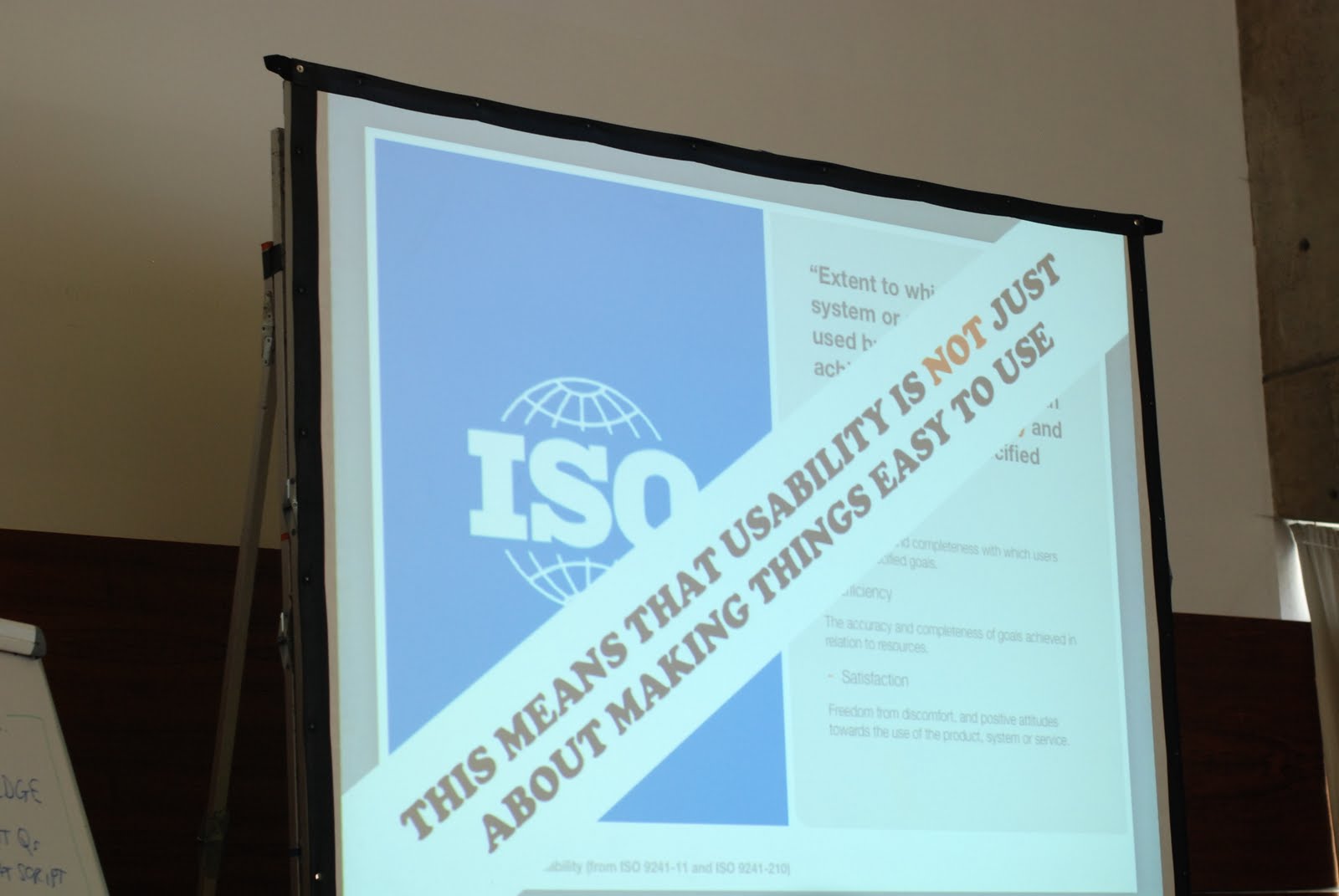
Josh Clark - Cage Match: Mobile Web vs. Native App
Challenges
 - Many platforms, many cultures
 - Choosing a platform is not only a techniqual decision it's also a decision about culture

Platforms:
Blackberry - the sensational suit, keyboard kommando, corporate crusher
IPhone - Aktive browsers, active buyers,...
Android - It's the technology, User experience doesn't have the highest priority
Windows mobile - the former champion; classy, urban, modern

Split decision: There will be no winner in the near future.

Web
Everyone loves her!
You don't need to create various apps for the different platforms and it's available.
The Web's UX weaknees: You can't compete with apps in speed, polish,...

Native App vs. Web: Not a real fight! Enemies are friends!

Suggestion: One mobile website and reward them with flagship native Apps. Choose 1 or 2 platforms, aim for the mobile culture that match you customer...

Content across devices and context: many devices, different views
Mobile apps NEED mobile content (navigation, content, ...).
The difference from usual websites is the size.
Mobile content doesn't only mean less content, because using a small screen doesn't mean to do less.
Core content must be there, probably only the hierarchy is changing.

An App is not a strategy it's only an App.
Don't think about every app alone.. See it like seamless content flow over all platforms.

Christopher Fahey - Squandering the cognitive surplus
User Experience Designer are not onyl doing the user interface.

They think about what the user gives and gets from the application
 - Interaction - user behaviour
 - Information - content strategy
 - Cognition -the process of thinking

Biocost - energy, time, intention, stress associated to a task
We as user experience designer should take biocost into account.

Dario Buzzini - The manual of detection

3 hypothesis:
We write stories not manuals.
We design experiences,  not procedures.
We strive for beauty not truth.

Ten Detection Probes
 1. On Shadowing:
Taxonomy of Skills. It's not about roles, it's about what somebody can provide to a problem.
 2. On Evidence:
As a designer look for evidence - learn how to talk the right language.
You need to be able to open the clients easy and you need to be able to do it.
 3.  - oh I missed it -
 4. On Documentation
Make the documentation actionable: User Journey, Venn Diagramm, Two by two
Empowers designers to be creative.
 5. On Bluffing
Designer sometimes lie to make great products or push innovation.
 6. On Interrogation
Looking for the answers before you ask the question, Ask the question, You need to understand the behviour of the user.
What people say and do is different to what they think and feel.
 7. On Crypography
We make it sometimes a little bit more complex as necessary.
Keep it simple, visual, ...
Example: PNC
 8. On Nemesis
We like to look at extremes.
 9. On Solutions
Bring you ideas to experience, Prototyping
LiveView - Screencaster to capture Photoshop and try it on you phone
 10. On Dream Detection
We need to be sure that we build a vision/an innovation.

Don Norman - Living with complexity
If you are not failing, that means you are not trying hard enough.

If you show the numbers to convince somebody, that means your lying.

Never solve the problem the client ask me to solve because it's always the wrong problem.

Everybody complains about problems to be too complex... So we need to think about simplicity.
We try to figure out what the people need and the marketing try to figure out what the people are buying.

Salt & Pepper: What is what?
The important thing is what the person fills thinks.
Look for hacks - thats a sign for a problem and a workaround

Culture & Complexity
Preference - Complexity: Things that are to easy the customers doesn't like. There is a specific area of complexity they like most (desired level of complexity). This area is based on the level of experience.
Difficulty & Skill: Between the bored zone and the frustrated zone there is the flow zone. This is the zone with the correct amount of challenge (Mihaly Csikszentmihalyis "Flow)
Teslers Law: The conservation of complexity
 -  We should be able to create an idea in the morning, create a prototype in the afternoon and test it in the evening.
A very rapid prototyping-approach.

The enemy
 - Reviewers: "Despite some missing features...."
 - Salespeople: They want to sell the thing with the most functionality

Desirability will increase by the number of features - thats somehow true, but the Usability is decreasing.
But they don't need to be a tradeoff between functionality and usability.
Solutions:
 - Natural: social signifiers (visual, tactile, ... - they can become natural) - e.g. Recommendations at Amazon. What articles were recommended by our users,...
 (Affordance: Relationship between a person and the environment)
 - Artificial: Good design
Conceptual Model:
 - File system representation: It's not a direct representation of the storage, it has a totally different structure.

Systems Thinking
 - Design for the whole system.
  ○ iPod - iPod, Licensing Music, Simple website to find the music, easy to buy, music directly at the computer - so the whole system was designed to be as easy as possible
  ○ Kindle  vs. Sony eBook: With Sonys eBook you need to figure out on you own how to bring the book on you eBook. For using Kindle you don't even need a computer.

Br, Claudia

May 17, 2011

UXLX - 4: Friday Talks - Part 1

Hi,

last Friday at the UXLX a lot of interesting talks took place. Here is my overview of the first part.

Louis Rosenfeld - On not declaring victory: Going beyond user research

Insights live in different silos.
- The reports from the user research group
- Query data gleaned from site search team
- The logs from the call center
- The reports coming out of the analytics applications
- Insights from Voice of the Customer research (surveys)
- CRM data
- The insights coming out of the research center.
Louis Rosenfeld

A nasty, three-headed cartographic challenge
1. Fragmentation: Tell us where an organizations insights live
2. Differentiation: Tell us what kind of insights there are
3. Synthesis: Tell us how to combine them effectively

The organization's challenge: thinking with a whole brain.
Some recommendations:
- Get out of your silo
- Establish what's common: KPI / goals, Segments/personas
- Map it: Maps, after all, are designed objects

Put people together from different silos
Win it: Companies that integrate their silos of insight will outpace their competitors

Christian Crumlish - Playful Design
Play - all the concepts of play he's working on has something to do with moving in space.

Masks: Putting on a role
Make belive: Invent themselves online
Reimagining: Play a role
Games:structured play

Games:
- Needs to start of with an invitation: "do you want to play"
- Boundaries: You have a system you play in
- Rules
- Goals: What is the goal of the game?
- Competition
- Cooperation

"It's easy to make a game fun, but it's hard to make the HR website fun."
Christian Crumlish

Nick Finck - The Cross-Channel Experience
Nick Finck

What is cross-channel experience?

Cross-Channel experience Design is the process of designing for all the touchpoints a person has with a business regardless of channel.
- Interactive touchpoints: Web, mobile, etc.
- Human touchpoints: Sales person, hotline, etc.

What you should do...
  • Know the context of use
  • Attention to detail counts
  • Look for hacks
  • Follow the whole engagement
  • Learn the business process
  • Understand how employees work
We need business on the site to improve here.
- We must break down the silos.
- We must cross-pollenate (collaborate with different parts of the company)
- We must work more like a hive.
... With a unified version of what we're trying to do.

Stephen Anderson - Critical Thinking Skills for UX Designers
Critical Thinking Skills - Z-Shaped Thinkers:
○ "When everyone zigs, zag."
○ Changing what you are doing through critical thinking

Z-Shaped Thinkers approach challenges (of all kinds!) in different ways.
Skills of Z-Shaped Thinkers:

  • Rephrasing the problem
  • Explore many perspectives
  • Synthesize information
  • Embrace constraints
  • Challenge assumptions
  • Appreciate details
...In oder to envision unseen opportunities.

Stephen Anderson

Kristina Halvorson - Content/Communication
Problem: We still think about content as copywriting? It's just writing and everybody has Word :-)

Tools to get the writer in the room at the beginning - Content strategy
Content strategy plans for the creation, delivery and governance of content.

Core content strategy - What are we going to do with our content?
Content components: Structure & substance
People components: Workflow & governance
Kristina Halvorson
Br, Claudia

May 16, 2011

UXLX - 3: Usability testing bootcamp

The 2nd workshop I visited on Thursday was the "Usability testing bootcamp" by David Travis ..and here are my notes:

Usability is not JUST about making things easy.
- Just measuring Completion rate is not enough
- Just measuring Satisfaction is not enough
- Just measuring Time is not enough

Number of users for Usability Test
- Are 5 users sufficient? 5 users is based on the assumption that you develop iteratively.
- Steve Krug: "Testing one user early in the project is better than testing 50 near the end"

Phases of the usability test
- Identify the test goals
- Recruitment
- Identify the test tasks
- Preparation
- Consent: If the user is ok with the usability test
- Context-Setting: explanation of the method
- Demo Thinking aloud by the moderator
- Explicit Permission to start using the technology
- Practice thinking aloud with the participant (with an easy task that has nothing to do with the test itself)
- Task creation
- Moderated the test
- Survey
- Incentive

Usability test situations
- Portable test lab: Take the system to the user
- Single room setup
- Classic testing lab setup (one-way mirror)
- Classic benchmark test: Time on task - no think aloud
- Multi-room setup: Observers in another room
- Remote moderated test
- Remote unmoderated test

Writing test tasks: Headline Tasks ("red routes") are the most important things to test.
Ask the following questions...
- Is it really a red route?
- Is it specific and measureable? (is there a begin and endpoint)
- Does it describe a complete activity (integrated, not simple tasks)?
- Is the task "portable" to competitor products, systems or services?
- Does it include enough information to complete the task yet avoid hidden clues?

How to moderate a usability task
Hats of the moderator:
- Flight attendant: Welcome the participants, provide coffee, small talk,...
- Sports Commentator: Talk to inform the observers, Remind the user to think out loud, let the user to repeat the task in his own words, ...
- Scientist: Responsible for avoiding test bias and recording the data.
Br, Claudia

UXLX - 2: Short sessions - Magic, hurt feelings and forgiveness & Usability testing with mobile devices

The 2 short sessions I visited today were "Magic, hurt feelings and forgiveness" by Oli Shaw and "Usability testing with mobile devices" by Belén & Bernard.

Magic, hurt feelings and forgiveness by Oli Shaw

Fun & Inspiration:
- Costs of technology keeps falling
- Science fiction is becoming science facts

Pythagoras: There are no miracles, there is only ignorance.
Paracelsus: Magic meant the natural forces which were not yet completely understood.

Over time technology was always between Science and Magic.
Magitek - Magic & technology: Devices, apps, services..
- Explicity magical: Microsoft Wizzard, Magic Mouse, HTC Magic,...
- Implicitly magical: Mobile phones
- Unrecognized as magical: Skype, WiFi on moving,..

What are the principles of Magitek?
- It seduces through mystique & power
- It creates wonderment
- It can be used without thought
- It hides the complexity of its mechanics
- It goes beyond the obvious needs and expectations
- It leads into something deeper....

Kano model:

- Excitement can become to an basic need
- Something delighting can become disgusting very fast.

Usability testing with mobile devices by Bélen & Bernard
Extra challenges for mobile testing

- Which context?
- Which phone?
- Which connection?
- How to record?

Test your mobile software in the field... Testing in the field with mobile phone is difficult, time consuming and expensive.
- Some testing is better in no testing...  So test it in lab situation...

Use the participants own phones for the test!
The user needs to be familiar with the phone - the usability of the phone should be irrelevant (its realistic)

Don't test over WIFI - and switch of 3G.
You have to cover the costs of the participants!

Capture the test
- Mount camera on the mobile phone - very intuitive
To build you own mobile software lab: 138,68€

Br, Claudia

UXLX - 1: Know thy users

The first workshop I attended at the UXLX was the workshop "Know thy users: Persona-Centered Design" by Steve Mulder. I already read his book about personas so most of the information I already know but I was very interested in the topic of discussing obstacles.

First a short of the main facts:

Steps to convince a CEO - the heart of user-centered design
- Business results depend on satisfying users
- You are not your user
- Learning about users requires direct contact
- Knowledge about users must be actionable
- Decisions should be based on users

A persona is defined by
- Goals
- Behaviours
- Attitude

Why can personas help?
- Bring focus
- Build empathy
- Encourage consensus: Shared vision
- Create efficiency: Everybody agrees early on the same direction
- Lead to better decisions

The Breath of Life - The elements of realism
Make personas real:
- They are much more memorable

Personas
- Name: Real name, allitaration can be used (Alice, Assurance Seeker)
- Key differentiators: Goals, behaviours and attitudes what is making this persona unique
- User Goals: Primary reasons why they are using this
- Pick Photos: Make them real, no models - http://www.scx.hu/, http://www.morguefile.com/, http://www.istockphoto.com/
- Personal data: Age, Family status, ... Data that mathers for the application
- Profile: Mini-Biography, first person version, why she is here, what she loves, etc.
- Quotes: Captures what the persona might say?
- Business value: If data is available
- Priorization of the persona: primary persona or 2nd level persona (primary, secondary, unimportant, excluded)

And in the discussion about the obstacles I captured the following notes:
- Time: Convince customer, that they can use the personas through the whole process - usability testing & marketing

- Personas as part of the project: Present them in the kick-off
- Not convinced project team/company: Start with high level personas and refine them, or start with a small project and communicate improvements
- Customer is not the user: You could create 2 sets of personas
- Personas dying in long projects: Impersonate personas with actors
- Difference between stable characteristics & characteristics in specific situations: Persona is a habit, but they can change behaviors. You should cover both or what is related to the product you are designed.

Now I looking forward to participate in the workshop about Usability testing by David Travis...
Br, Claudia

May 6, 2011

Links - "Best of": Mobile Web Design, Integrate UX into Agile Development and Innovative Techniques to Simplify Log-Ins

Hi,

today again I want to share a few links you might be interested in:

Video: Mobile Web Design Interview
LukeW - April 5th, 2011
First I want to share with you an interview of Michael Slater with Luke Wroblewski. In my last post I have written about Lukes book "Web Form Design" and in Summer his new book will be out... "Mobile First". In the short interview he gives an insight in the new book... I'm already looking forward to it.

Integrating UX into Agile Development
UXmatters, Janet M. Six - April 18th, 2011
Ask UXmatters interviewed 6 usability engineers about how they integrate the UX methods into the agile development process. The articles covers topics like Success factors for Agile UX, Adapting User Research to an Agile Approach, Team Dynamics, ....

Innovative Techniques To Simplify SignUps and and Log-Ins
Smashing Magazine, Anthony T - May 5th, 2011
Everybody see it several times every day .... the log-in Screen. Anthony T summarized a lot of techniques how the signups and log-in screens can be improved to help the user. Some of  them are more or less common sense like "Auto-complete the country field" but a few of them are not very often used like "Require users to type their password only once" and "Allow users to  unmask their password".


I'm already looking forward to the UXLX conference next week in Lisbon with a lot of interesting workshops and talks... I will try to share my experiences with you over this blog and my twitter account.

Have a nice day,
Claudia

Apr 4, 2011

Book Review: Web Form Design > Filling in the blanks

Hi,
The cover
in the last weeks I tried to read the book Web Form Design - Filling in the Blanks by Luke Wroblewski because I'm very interested in the topic.

The content of the book in general is very interesting but I don't know why the book wasn't able to get my full attention (and I tried it several times).

I wasn't very happy with the layouting and the structure of the content. A lot of prosa text for things that can be said in a few bullet points - so in my opinion a lot of unnecesary words. The examples used to visualize the different topics were ok, but sometimes it was not so easy to match the correct explanation to an example.
Good examples but not the perfect structure.
Perhaps I was a little bit influenced by the last book I read about this topic - "Forms that work" by Caroline Jarrett and Gerry Gaffney (my short review). It was perfectly structured with great examples and explanations that were easy to understand ...

Only for clarification... I think the book by Luke Wroblewski is good but not as fascinating as the book by Caroline Jarrett and Gerry Gaffney.

Br, Claudia

Mar 16, 2011

Links - "Best of": User Experience cannot be designed, Lean UX & More, better, faster UX design

Hi,

today I want to share with you some interesting links of the last days.

Why User Experience cannot be designed
Smashing Magazine, Helge Fredheim - March 15th, 2011
UX doesn't depend only on how something is designed, but also on other aspects, because we cannot design the user and we cannot design the situation in which the product is used. Fredheim gives a great new perspective how we should see the UX work... because it's not limited to usability or information architecture.

Smashing Magazine, Jeff Gothelf - March 7th, 2011
Traditionally user experience design is very deliverable-oriented. So most of the times a huge amount of effort is used to deliver documents instead of working on end-user experiences. Lean UX, inspired by lean and agile development techniques, tries to bring results faster to life with less emphasis on deliverables and greater focus on the actual experience being designed.


More, better, faster: UX design for startups
The Cooper Journal, Stefan Klocek - March 16th, 2011

This article, also related to the Lean UX idea, is focusing on how the UX process can be speed up to be able to show results very fast.
3 to 5 days for each "learn-build-measure" cycle are suggested. But fast shouldn't be dirty so pair design - as we know the concept already from software development - is recommended.

Br, Claudia

Feb 18, 2011

UX Events in Europe & why don't usability problems get fixed?

Hi,

today I want to share two user experience events in Europe you might be interested in.

One - I'm not sure if I will attend - is the UX LX in May - an User Experience Event in Lisbon with a lot of interesting speakers and workshops.

The 2nd event is the UXcamp Europe on the 11th and 12th of June in Berlin. I will be there and if you too perhaps we can get in contact...

And now a link that may be interesting for you.

Why don't usability problems get fixed?
UX matters, Jim Ross - February 7, 2011
The usability test is done, you worked on good solutions for the usability problems and presented them to the team.... A few weeks later only a few of your recommendations are implemented - what's wrong?
Jim Ross collected reasons and limitations and also provides some ideas how this problem can be solved.

Have a nice weekend,
Claudia

Feb 7, 2011

SpecLog is here... the new tool for organizing requirements.

Hi,

I'm very proud to inform you about a cool tool where I'm involved as a Usability Engineer in the development. The tool is called SpecLog and should help to organize requirements for agile projects in a more natural way using story maps for showing the relation between goals and user stories and capturing the acceptance criteria.


The best features in my opinion are the TFS integration, the customization of the requirement cards (language and process independent) and of course the synchronisation of the repository (backlog) from different clients. Useful if you have already a backlog is the Excel import.

SpecLog is free at the moment because this is now the beta phase so you have enough time to have a look and try it out.

We already have a lot of ideas how to improve but we are always looking for new inspiration and ideas so your feedback is highly appreciated.

You can find more information and the download link at http://www.speclog.net/.

Have fun...
Claudia

Feb 2, 2011

Book Review "Forms that Work"

The book "Forms that Work - Designing Web Forms for Usability" by Caroline Jarrett and Gerry Gaffney is a must read for all usability experts dealing with business applications and online forms. I would also recommend it for developers interested in these topics.

Like the books by Steve Krug ("Don't make me think" and "Rocket surgery made easy") this book is filled with a lot of great examples and the focus of the content is on the relevant topics.The chapters are dealing with Persuading people to answer or making questions easy to answer to choosing the forms controls and making a form look easy.

A lot of examples with good explanations

More information about this topic and the book can be found on the Forms that Work website.

Have a nice day,
Claudia