Showing posts with label Usability principles. Show all posts

Jun 21, 2015

UXcamp Europe 2015 - Day 1/Part 1: UX Guidelines, Visual User Resarch and Expert Reviews for Mobile

This weekend again I'm participating in the great UXcamp Europe in Berlin. During the Session Planning it is always fantastic to see how many participants step up to propose sessions. For most of the time slots the though task is too chose one out of the 7 parallel tracks.
Session Planning on Saturday Morning
Here are my notes and thoughts of the first three session of day 1.

#1 (Unofficial) Top 10 UX Guidelines - Jasson Schrock

The first session I visited was by Jasson Schrock (Onefootball) presenting the 10 UX Guidelines they want to establish in their company. He pointed out very well what UX experts should focus on. Some of the guidelines are very common sense in the UX community, but often still ignored.

The 10 guidelines are: 
Planning Phase
  • Increase users happiness
    He pointed out that speed and simplicty are important, but not always the answer, and that it is important to empathize with the user in order to understand his needs.
  • Solve a user need and make it a habit
    The Toothbrush Test is a possiblity to check if it could evolve to a habit - "Would you want to use it twice a day?"
  • MVP shouldn't been not just feasible.
  • Make it valuable not just feasible.
  • Plan for the next steps but focus on the MVP.
    New ideas should be collected and prioritized. 
  • Implicit over explicit personalization
    We should keep the complexity on our end, not the users. To add a new feature just as a new setting that the user should take care of is not a solution.
  • Tell a story
    ... and it's not a feature list.
Design Phase
  • Have a clear visual hierarchy
    Check if your design can pass the squint tests. Squint - and check if you can still identify the primary and secondary hierarchy.
  • Provide feedback for every interaction
  • Encourage interaction with context
    For example community details can be used to improve gamification and encourage exploration (e.g. # of review, ratings,...)
  • Be consistent. 
    ... and don't reinvent the wheel. Use common design frameworks so the user know what to expect.

#2 Visual User Research - Jan Diettrich

Jan (@simulo) did a nice presentation about Visual User Research. He presented various techniques of how visual techniques can be used to facilitate user research and improve the outcomes of workshops with users. With these visual tools you can focus on documenting workflows, moods, relations, etc.

Why visual tools?
  • It's accessible for researchers and participants alike.
  • It gives an overview
  • It's easy for referring back
  • Mood diagram with annotations
  • It helps not asking for features but for users experience
Sequence:
  • Explain the task including an (not to well drawn) example 
  • User should draw/write by himself
  • Ask for more information, clarification, demonstration
  • Wrap up
We also tried out the method of a mood diagram by drawing the mood of "Breakfast" from preparing to enjoying... It really was interesting to see which different moods various people are going through (motivated to prepare, because everything is smelling good vs. checking out that some ingrediants are missing)

I really appreciate that Jan provides all the templates and also a short book about the methods open source, so you are free to use it. (He would be happy about feedback or adapted templates.)
  • Templates & Description: https://m18.uni-weimar.de/~jand/static/researchAssets.html 
  • Book "A Beginners Guide To Finding User Needs": https://jdittrich.github.io/userNeedResearchBook/
He also recommends the book "Convivial Toolbox: Generative Research for the Front End of Design" by Liz Sanders and Pietter Stappers (on Amazon).

#3 WTF? Evaluating Usability Without a User - Expert Reviews in the Age of Mobile - Hans Joachim Belz

Hans-Joachim talked about Expert Reviews. Because I'm using that very often in my daily business it was very interesting especially with the focus on mobile reviews.

Expert reviews are cheap and can be surprisingly effective (check out the CUE reports).

WTF? Usability without a user?
Good expert reviews take into account
  • User needs
  • Mental models
  • Typical perception behaviour
Experts have extensive experience with user behaviour (use lab experience, participating in user research efforts,...).

Pro Tip #1: Create maps of needs & mental model
The map and mental model should be based on research.

Pro Tip #2: Multiple experts
  • If possible let more than one expert review the product.
  • Every expert tests independently. 
  • Build consensus about your test results by a thourough and frank discussion of your observations.
Pro Tip #3: Use scenarios (and personas)

The Usability Inspector ... 
  • Should have a (small) usability focused set of test devices
    • Main display sizes, aspect ratios and screen resolutions
    • Leaning towards the more contrained devices
  • Should have a agreed set of evaluation criteria including
    • Information Architecture
    • Interaction Design
    • Domain-specific aspects
AND you should evalute complete user journeys based on scenarios.

Apr 25, 2015

UXcamp Vienna 2015 - Highlights: Usability testament, little money, heroes & communication

Last week the UXcamp 2015 in Vienna took place. The organizational team did a great job and we had 4 parallel tracks, so a lot of talks we could choose from. One highlight was of course the keynote by Rolf Molich.

Keynote: Rolf Molich - The Testament of a usability professional - 8 lessons from 32 years with usability

I want to highlight two of his learnings - #1 was that the more things change the more they stay the same. I agree 100% with this - because the basics haven't changed: the methods we use in usability haven't changed in the last years and how humans perceive and act is still the same, so the basic design principles are still valid.

And the second lesson was that we as usability engineers should set good examples and should sweep at our own door before you sweep the door of your neighbors. For example also our documents we create should be easily readable for the "users".

Include positive findings in your usability report, because "even developers have feelings".


Session #1: Improve UX with Little Money by @sarapoetze

Sarah presented ideas how UX improvements can  be done if there's not a big budget for usability available. The four topics:
  • Use data that is already there (support request, read reviews in social media, analytics data, use photography for communicating ideas of the users environment to the team)
  • Get information in your team (ad-hoc personas by Tamara Adlin - but be careful!)
  • Get information remotely (remote usability tests, questionnaires)
  • Guerilla testing (test with colleagues, pedestrians, etc.; Informal testing session with users (Barbecue); Tool: Rainbow Spreadsheet (Google))
During the discussion we collected further ideas and it's always a good idea to stick to Standards.

Session #2: Design Heroic Experiences by @DamjanObal

Damjan had a nice idea - he tried to map the Idea of "a Heroes journey" to the process of creating a Product or Project Vision.
Silly outfit
  1. The Quest: What is the Problem we wan to solve? It's necessary to solve a real Problem.
  2. Help Lois: Know the user, know their Problem and help them.
  3. Villains: Who is the competitor? You should know him well.
  4. A hero is special (after dark) & as you and me (during the day): The product is powerful and smart (in the backend) & simple and minimal (frontend).
  5. The super: The product should have something Special.
  6. Silly Outfit: The design makes it complete and can make it catchy.
Stan Lee: "More than normal, but believable."
Don't design something that is "out of space" - it should be approachable.

Damjan provided his slides on Slideshare.

Session #3: Agile Design Thinking in Distributed Teams by @CForaita

Chris presented based on one project how the team managed to work with distributed teams in an agile project.

The core idea was to have one kick-off workshop at the beginning together to share ideas and work on the project together - some details:
Empathy map
  • Keep the team small (only participators, no observers)
  • 3 days: one room, no chair > Idea: No boring Meeting
  • Various methods, but all focused on gathering a lot of data
  • Method for getting everybody at the same bus: 100 cards with random words, they had to scissor out 6 words "How would your product work best?"
  • Empathy map for users
  • Design product box: White paper bags, melt down everything what you learned in the last days > visible what is really important.

Session #4: UX - zwischen Forschung und Praxis am Beispiel Medieninformatik by @peterpur

Peter Purgathofer of the technical university in Vienna presented how they work on projects and presented the project Aurora 2015. This is a tool for sharing information between students and teachers and organizing the tasks the students need to fulfill.
The project is open source and available on github.

Session #5: How can I ensure better communication in teams? by @KarinCepin

The last session was a very interesting talk and discussion of how communication can be improved in teams. Of course a important method here are the "Retrospectives" and that we should pleasure failing.
"Failing is a big methaphor for learning an improving."

We discussed that it is very important to feel save in retrospectives. And Karin recommended the Book "Project retrospectives by Norman Kerth:
"Regardless of what we discover we need to understand that everybody did the best job , … "

During the discussion we collected further ideas how to improve communication in teams:
  • Learning Session: there should be room to share what we learn (e.g. Dev-Jour Fixe).
  • Finding a Mission Statement in the team
  • "Getting to yes"-Method by Steve Blank: if the team has a problem they should ask themselves questions like "What would it cost for the company and would be the impact?" in order to provide this information to the management (further Information)
  • Involve the team (different roles, different departments) in the ideation Phase (e.g. Creating the backlog together with the whole team)
  • Support collaboration with pair programming, pair testing, bug fixing sessions


Like usually at UXcamps I learned a lot, had interesting discussion and met great people, See you next year :-)

Dec 21, 2009

Anybody can do usability ...

Hi everybody

I just read the new blog article by Jakob Nielsen and I want to share this great statement with you:
Usability is like cooking: everybody needs the results, anybody can do it reasonably well with a bit of training, and yet it takes a master to produce a gourmet outcome.

I also have the opinion that everybody - if he/she is interested in the topic - can learn the basic skills to find usability problems in advance (by scribbling screens) or afterwards (by reviewing the application). So, read the article ... it's really great.

Br/Üdv/LG
Claudia

Sep 17, 2009

Compatibility... different browsers & different operating systems

Hi,
today I want to share with you some nice tools for testing web applications where you can test the appearance and behavior in different browsers and also on different operating systems.

IE Test
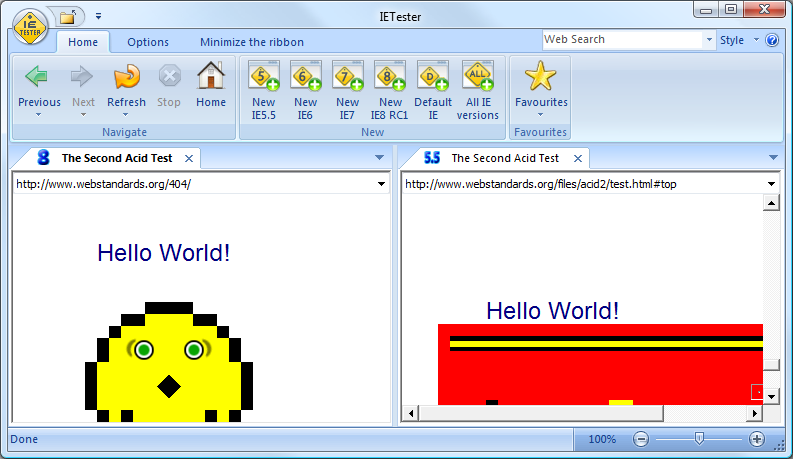
We all know the problems with the different versions of the internet explorer and IE Test is a tool to check the application in the versions from 5.5 to 8.

Microsoft Web SuperView
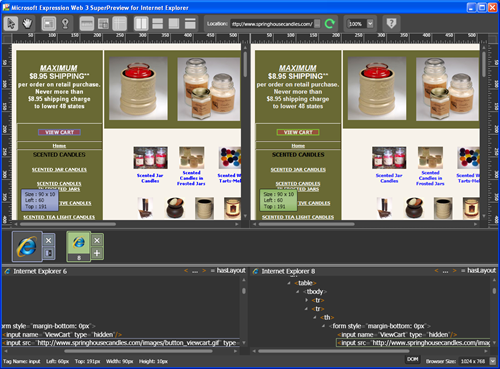
Also Microsoft provides a tool where the application can be tested with different IE-versions and the websites can be compared on one screen. You can download it here.


Browsershots

A very nice tool is browsershots.org. This websites gives you the opportunity to view your website in various different browsers on different operating system. As a result you get screenshots from the specific page in the different environments.

If you know any useful tool it would be nice if you leave a comment.

Br, Claudia

May 8, 2009

Web content accessibility and heuristic evaluation

Hello together,


today I want to introduce you to the WCAGs 2.0 - the web content accessibility guidelines and how to evaluate an existing web site using heuristic evaluation methods as described by Jacob Nielsen.

Web Content Accessibility Guidelines [1]
These guidelines are a good basis to work on when designing web pages for different groups of users including for example visual impaired people and more or less describe what to consider. Important to know is, that these "principles" are just recommendations and not rules.

The W3C consortium describes the WCAGs as follows:
Web Content Accessibility Guidelines (WCAG) 2.0 covers a wide range of recommendations for making Web content more accessible. Following these guidelines will make content accessible to a wider range of people with disabilities, including blindness and low vision, deafness and hearing loss, learning disabilities, cognitive limitations, limited movement, speech disabilities, photosensitivity and combinations of these. Following these guidelines will also often make your Web content more usable to users in general.
These guidelines cover a wide range of different topics like how perceivable or how understandable a site is or how good the interoperability is when just using a keyboard. It would be too much now to go into detail but I want to list just a few principles which are the most important ones for me:
  1. providing alternatives for all elements: this means, providing ALT attributes for images or video content
  2. the contrast between the foreground and background should be a good one to make it easy to differ between real information and background info
  3. the UI should be navigable using a keyboard only - so setting the TabIndex attribute is important
  4. when designing forms, provide the "name" attribute for the input fields and put them into relation with labels using the "for" or "label" attribute
  5. when structuring web content, use the H1-H6 elements to do so, 'cause usually screen reader applications rely on them
Considering just these 5 principles make it much more easier to build good accessible web pages.


Heuristic evaluation [2]


Heuristic evaluation is, according to Jacob Nielsen, a discount usability engineering method for quick, cheap, and easy evaluation of a user interface design.

Heuristic evaluation works the following way:
  1. find "principles" - so called heuristics on which the evaluation should be based on. In our case, these heuristics would be the WCAG principles. Such principles are usually defined by a group or a single person, commonly used and good recommendations to follow but should not be considered as fixed rules
  2. according to these principles, evaluators - who are usually usability experts - go through the whole interface of the application step by step and take notes, when the UI does not consider one of the principles. Usually, a good number for the amount of usability experts to use is between 3 and 6, 'cause one expert will only find 35% of all the problems. 5 experts will find about 75% of the existing problems.
  3. after each evaluator has finished his process, they all meet together and compare their notes. Based on these notes, they rate the problems using the "severity rating". Therefore, each problem is assigned a number from 0 to 4, whereas 0 means, that there is no problem and 4 means, that it is a complete mess and a usability catastrophe
  4. at the end, these results are summarized and presented to the developer team or the customer
When designing web content according to the WCAGs and using heuristic evaluation you can make your content better accessible and help impaired people understanding your web content.

Heuristic evaluation is a quick method for reflecting your UI and finding major usability problems according to various heuristics. These heuristics can be the WCAGs as well as other defined principles.


[1] ... WCAG web site [http://www.w3.org/TR/WCAG20/]
[2] ... Heuristic Evaluation [http://www.useit.com/papers/heuristic/]
[3] ... How to Conduct a Heuristic Evaluation [http://www.useit.com/papers/heuristic/heuristic_evaluation.html]

Feb 23, 2009

Designing Interfaces (Jenifer Tidwell)

Hi,

last weekend I read the next book - Jenifer Tidwells "Designing Interfaces". In the post about Design Patterns I already mentioned the related website.

For me the book doesn't contain new information. It's a nice compendium of the main patterns and I think the book could be helpful if you want to find a solution for a specific problem.

If you don't know much about the design patterns than you should read the book. The various patterns are really well explained and visualized with good examples.

Br Claudia

PS: @Techtalker - This book is available at the foyer.

Feb 4, 2009

Design Patterns - Part 1 (of 2)

A few days ago I talked with collegues about design patterns and now I want to share with you several pattern libraries available on the web.

UX Patterns Explorer (Quince)

The UX Patterns Explorer is a Silverlight Application and you can browser through different UI Patterns using different modi. For example you can find patterns via a Wireframe or Tag connections. Every pattern is described with the problem, the solution and several "real life" examples.

Yahoo Design Pattern Library

The Yahoo Design Pattern Library provides UI Patterns sorted by the users tasks. Every UI pattern explanation contains also a paragraph concerning the accesibility.

UI Patterns
The UI Patterns website provides articles about several patterns, as well as screenshot collections sorted by the patterns.


UI Pattern Factory

Like the others the UI Pattern Factory is a collection of UI Patterns and there is the possibility to suggest new patterns and add examples using flickr.

In the next days you can find the second Part of the Design Pattern-Libraries here.
Br, Claudia

Jan 14, 2009

10 ways to ...

Hi,

today I want recommend you two interesting articles by the smashing magazine.

10 useful techniques to improve your user interface design
This articel sometimes refers to basics of visual perception, for example "White space indicates relationships" and "Using contrast to manage focus".

10 principles of effective web design
This article deals with the user attention and again the topic "Don't make users think"...

... the examples in the articles of the smashing magazine are really well visualized.. and you will find many more interesting articles like 10 Usability Nightmares You Should Be Aware Of and for the friends of Fitts' Law 30 Usability Issues To Be Aware Of (@ Ver: Only a few sentences about fitts.. don't worry ;-) )...

.. have fun,
Claudia

Jan 10, 2009

How do you design? - A Compendium of Models

Hi all,

today i want to share with you a link to a book which is written by Hugh Dubberly. He also writes articles for the magazine "Interactions".

The new book is called "How do you design" and is a compendium of design models. For the book Dubberly has collected over 100 descriptions of design and development processes.

The book (PDF) is available online > here.

Regards Claudia

Oct 29, 2008

Introduction to Good Usability

Hi,

today I want to show you a PDF called "Introduction to Good Usability" (by peterpixel).

It only has 20 pages (and a lot of images) and it gives information about interface design guidelines and principles of good usability focusing on websites.
(You also can find a printed version in my room).

Most of the principles are really obvious and if you read the book "Don't make me think" by Steve Krug you will recognize a lot.

So if you want to read more ... read the book - It is available @ TT and I really recommend this book (only 200 pages and very easy and entertaining to read).

Br, Claudia

Oct 23, 2008

Agile 2008: Developers, Interaction designers & agile

Alan Cooper is a famous interaction designer and this year he gave the closing keynote at the Agile 2008 conference. I recommend to view his presentation but it is only the presentation with detailed comments (no video).

His blog entry:
http://www.cooper.com/journal/2008/08/alans_keynote_at_agile_2008.html

The presentation itself:
http://www.cooper.com/journal/agile2008/

He also wrote the book "About Face: The Essentials of Interaction Design" (available @ TT, the green book) and "The Inmates Are Running the Asylum: Why High Tech Products Drive Us Crazy and How to Restore the Sanity".

Br, Claudia